Understanding the Impact of Color Psychology on User Experience in Calorie Tracking Apps
When it comes to designing calorie tracking apps and websites, the psychology of color plays a crucial role in enhancing user experience and influencing user behavior. Colors can evoke emotions, convey information, and guide users through the interface. In this article, we will delve into how color psychology is applied in calorie tracking apps and its implications for user engagement and health outcomes.
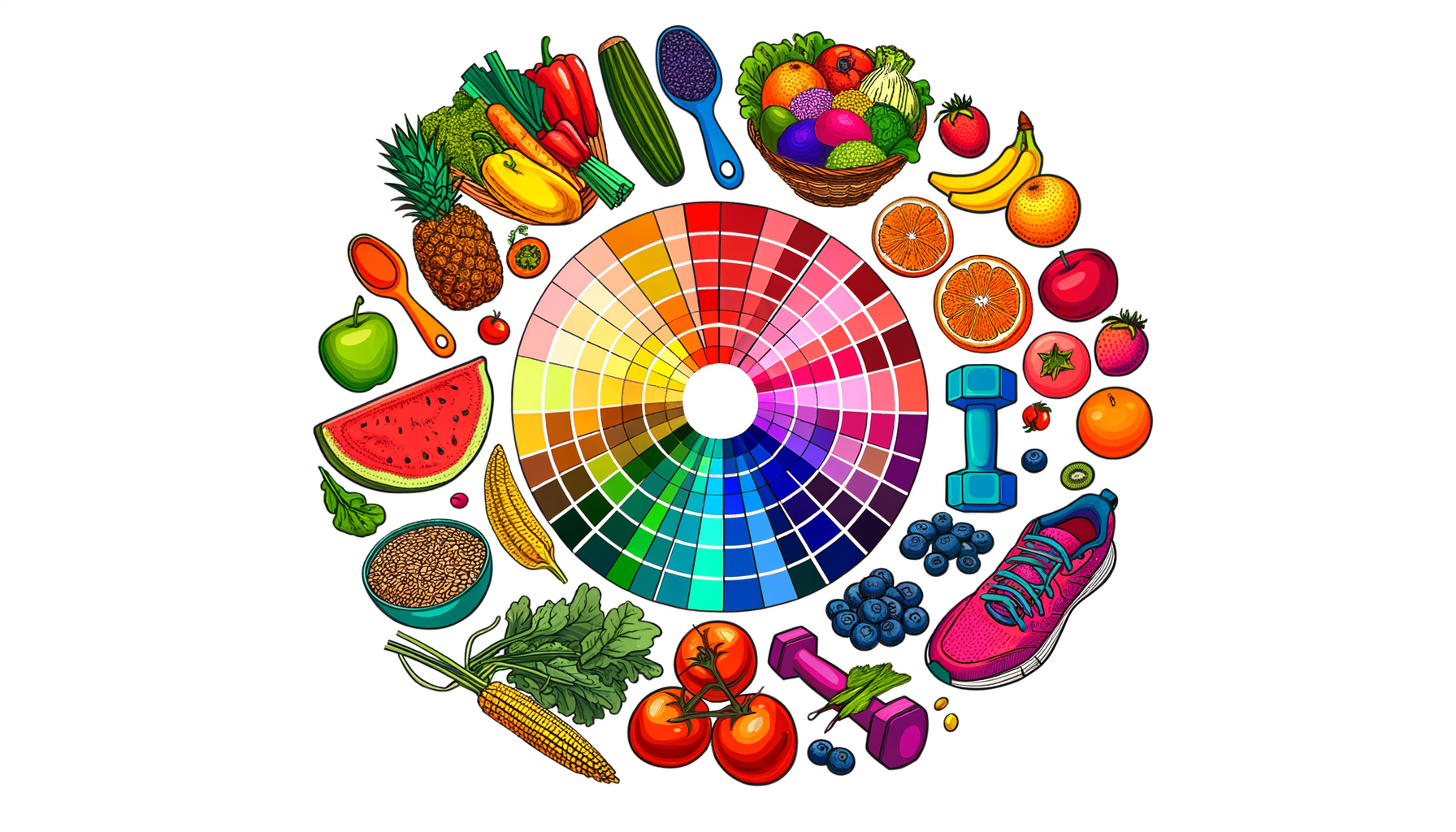
The Role of Color in User Experience
Colors are not just aesthetic elements; they have a profound impact on how users interact with an app. For instance, Noom, one of the top-rated nutrition apps, uses a color-coded system to categorize foods based on their calorie density. This approach helps users make healthier choices by associating certain colors with healthier options.
Here are some key ways colors influence user experience in calorie tracking apps:
- Emotional Response: Different colors elicit different emotional responses. For example, green is often associated with health and wellness, while red can signal caution or high calorie intake.
- Information Conveyance: Colors can quickly convey complex information. For instance, a green light might indicate that a user is within their daily calorie limit, while a red light might signal that they have exceeded it.
- Guidance and Navigation: Colors can guide users through the app, making it easier to navigate and find specific features. For example, using a consistent color for buttons or links helps users understand what actions to take.
Case Studies: Effective Use of Color Psychology
Several apps have successfully integrated color psychology into their design to enhance user experience and promote healthier behaviors.
Noom: As mentioned earlier, Noom uses a color-coded system to categorize foods. This system is based on the calorie density of foods, with green indicating low-calorie foods, yellow for moderate-calorie foods, and red for high-calorie foods. This visual cue helps users make informed decisions about their diet.
Shapa: Shapa, a mindful eating app, uses a color-based system to provide feedback on weight changes. Instead of displaying numerical values, Shapa uses colors like green, gray, and blue to indicate whether the user is maintaining, gaining, or losing weight. This approach reduces anxiety associated with traditional weight tracking methods.
Design Considerations for Calorie Tracking Apps
When designing a calorie tracking app, it is crucial to consider the psychological impact of colors on users. Here are some design considerations:
- Consistency: Use consistent colors throughout the app to avoid confusion. For example, if you use green to indicate healthy choices, use it consistently across all relevant features.
- Accessibility: Ensure that the color scheme is accessible for users with color vision deficiency. This can be achieved by using high contrast colors and providing alternative text or symbols for color-coded information.
- Cultural Sensitivity: Be aware of cultural differences in color perception. For instance, while green is often associated with health in Western cultures, it may have different connotations in other cultures.
- Feedback Mechanisms: Use colors to provide immediate feedback. For example, a green checkmark can indicate that a user has logged their meals correctly, while a red exclamation mark can signal missing information.
Challenges and Limitations
While color psychology can significantly enhance user experience, there are challenges and limitations to consider:
Overreliance on Quantification: Some apps may focus too heavily on quantification, which can lead to negative consequences such as obsession with numbers and exacerbation of eating disorders. It is essential to balance quantification with qualitative feedback and mindful eating practices.
Individual Differences: Users have different preferences and emotional responses to colors. Therefore, it is important to offer customization options or alternative visual cues to cater to individual differences.
Conclusion and Future Directions
The psychology of color is a powerful tool in the design of calorie tracking apps. By understanding how colors influence user behavior and emotions, app designers can create more engaging, effective, and user-friendly interfaces. As the health and fitness industry continues to evolve, incorporating mindful and intuitive design elements, such as those seen in Calorie Calculator Cloud, will be crucial for promoting sustainable health habits.
For those interested in exploring more about nutrition apps and their features, consider checking out the Calorie Calculator Plans or reading reviews on the best nutrition apps available today.
By leveraging color psychology effectively, calorie tracking apps can not only help users achieve their health goals but also provide a more enjoyable and sustainable experience.