Transforming Calorie Data into Engaging Infographics: A Comprehensive Guide
In the realm of health and fitness, communicating complex nutritional information in an engaging and understandable manner is crucial. Infographics have emerged as a powerful tool for this purpose, allowing users to visualize calorie data and other nutritional metrics in a way that is both informative and visually appealing. Here’s how you can use calorie data to create engaging infographics that educate and inspire your audience.
Understanding the Importance of Visual Content
Visual content, such as infographics, is more likely to capture and retain the audience’s attention compared to plain text. This is because visual elements can simplify complex data, making it easier for viewers to understand and remember key points. For instance, Venngage’s nutrition infographic templates are designed to blend essential dietary information with captivating design, ensuring that even intricate nutritional concepts are conveyed in an easily understandable and visually engaging manner[1).
Design Principles for Effective Infographics
When creating infographics, several design principles should be kept in mind to ensure the content is engaging and effective:
- Clear Typography: Use clear, readable fonts that are consistent throughout the infographic. This helps in maintaining a professional look and ensures that the information is easily digestible.
- Balanced Color Palette: Choose a color palette that is balanced and relevant to the topic. For nutrition infographics, colors like green, blue, and orange can be used to represent different food groups and nutritional elements[1).
- Relevant Imagery: Incorporate relevant food imagery and icons to make the infographic more engaging and to help illustrate key points. For example, using images of fruits and vegetables can help highlight their nutritional benefits.
- Structured Layout: Organize the data in a structured and logical manner. Break down complex information into chunks, and use charts, graphs, and diagrams to present the data clearly[2).
Using Calorie Data Effectively
Calorie data is a critical component of nutrition education. Here are some ways to use calorie data effectively in your infographics:
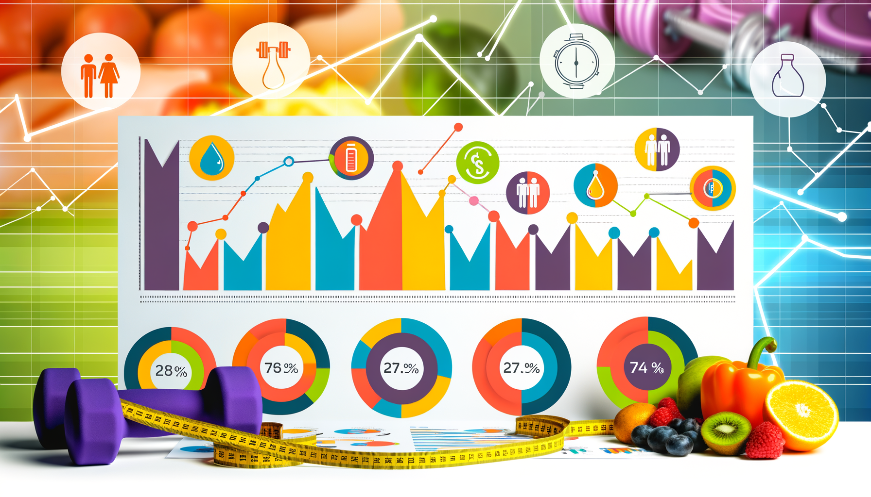
- Pie Charts and Bar Graphs: Use pie charts and bar graphs to illustrate daily calorie intake and the distribution of calories across different food groups. For example, a daily calories pie chart template from Visme can help visualize this data in a creative and visually appealing way[5).
- Comparison Data: Provide comparison data to help viewers understand the calorie content of different foods. For instance, an infographic could compare the calorie content of a fast-food meal versus a home-cooked meal, using illustrations to bring the data to life[2).
- Portion Control: Highlight the importance of portion control by showing the calorie content of different serving sizes. This can be done using visual aids like plates and cutlery, as seen in Ryan MacEachern’s Design x Food project, where food itself is used to create graphs and charts[4).
Real-World Examples and Case Studies
Several projects and case studies demonstrate the effectiveness of using calorie data in infographics:
- Design x Food: Ryan MacEachern’s project, Design x Food, is a compelling example of how calorie data can be visualized using actual food items. By using colorful, vibrant foods excluded from his diet, MacEachern created a visually appealing and informative infographic that compares the nutritional content of different foods[4).
- Venngage Nutrition Infographics: Venngage offers a range of nutrition infographic templates that cover various dietary topics, including macronutrients, portion control, and balanced meal plans. These templates are designed to be easily customizable and visually engaging, making them ideal for dietitians, educators, and health-conscious individuals[1).
Tools and Resources for Creating Infographics
To create engaging infographics, you don’t need to be a professional designer. Here are some tools and resources that can help:
- Venngage: Offers a diverse array of nutrition infographic templates that are easy to customize and use[1).
- Visme: Provides various infographic templates, including a daily calories pie chart template, which can be customized with a few clicks[5).
- SmartBug Media: Provides examples and tips on how to design infographics with lots of data, ensuring they are easy to read and visually appealing[2).
Conclusion and Next Steps
Creating engaging infographics with calorie data is a powerful way to educate and inspire your audience about nutrition and health. By following the design principles outlined above and using the right tools and resources, you can transform complex nutritional information into visually appealing and easily understandable content.
If you are looking to integrate calorie data into your health and fitness strategies, consider using tools like the Calorie Calculator Cloud to accurately calculate and track calorie intake. For those interested in customizing their approach, exploring the Calorie Calculator Plans can provide tailored solutions to meet your specific needs.
By leveraging the power of infographics, you can make nutritional education more accessible and engaging, helping your audience make informed dietary choices and foster a healthier lifestyle.
